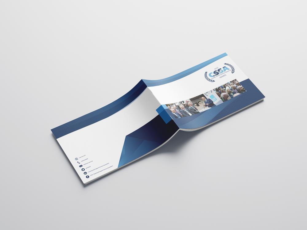
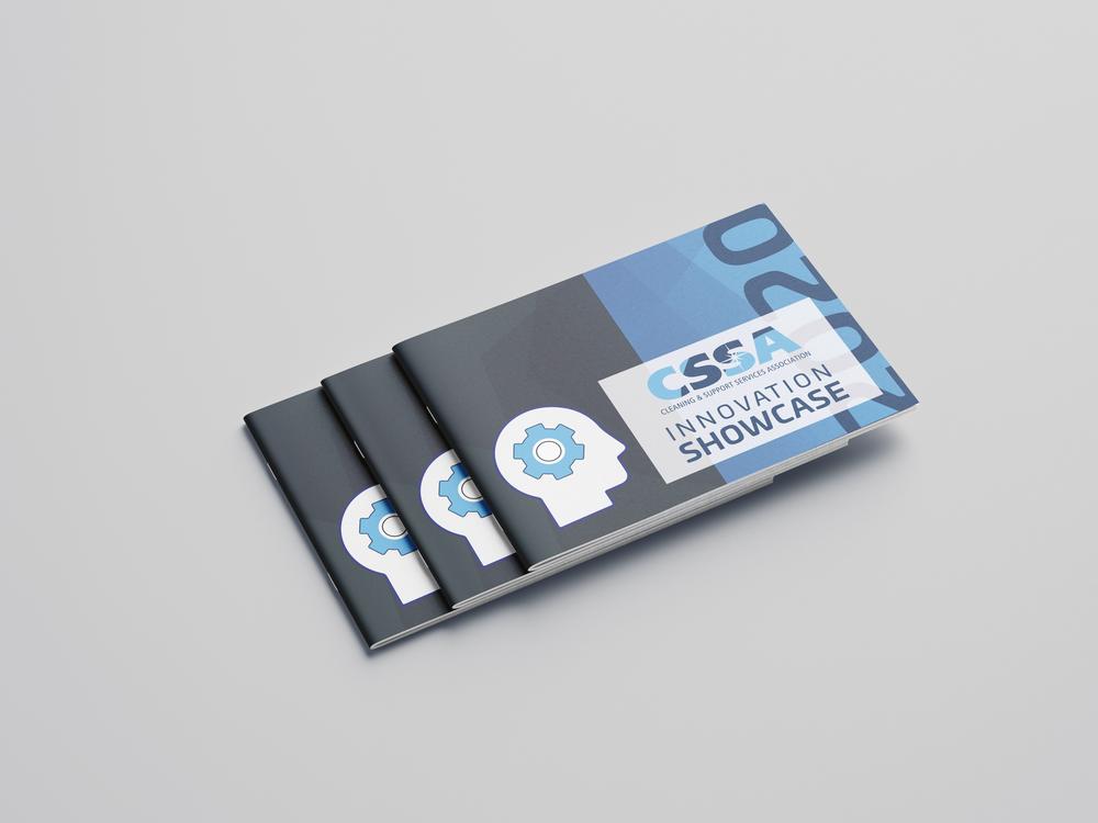
BRANDING, WEBSITE DESIGN, POS, CORPORATE BROCHURES, ONLINE ASSETS
CLEANING & SUPPORT SERVICES ASSOCIATION
For this company’s rebrand prioritising clarity, cleanliness, and professionalism was imperitive to reflect the organization's commitment to maintaining high standards of hygiene and order. A clean, minimalist layout with ample white space can evoke a sense of purity and efficiency. Utilizing a calming color palette, convey trustworthiness and tranquility. Clear, legible typography is essential to ensure all information is easily accessible and readable. Incorporating relevant imagery of communities and high tech appliances visually reinforce the association's mission and image of reliability and excellence in the cleaning industry.