VINYL RECORD DESIGN
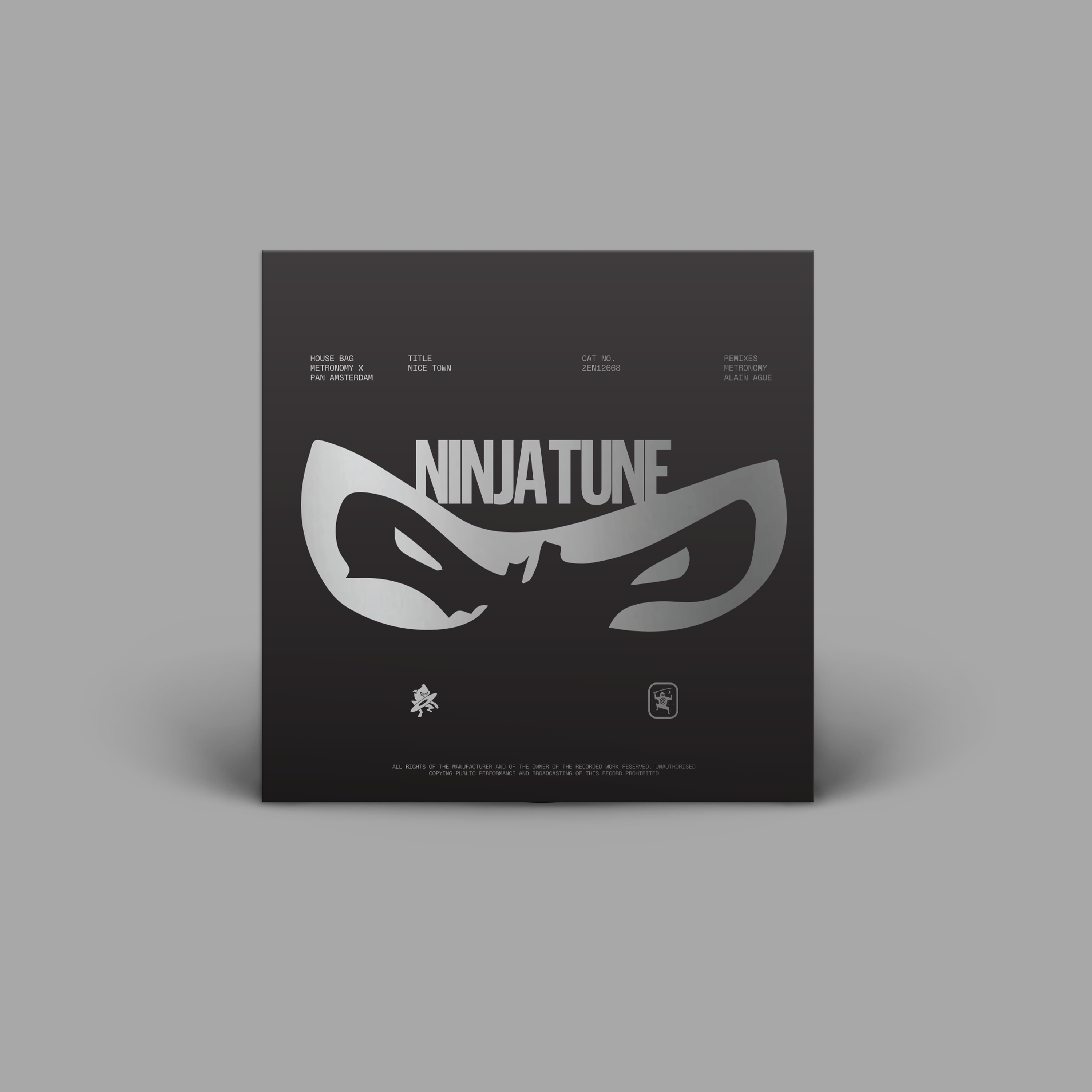
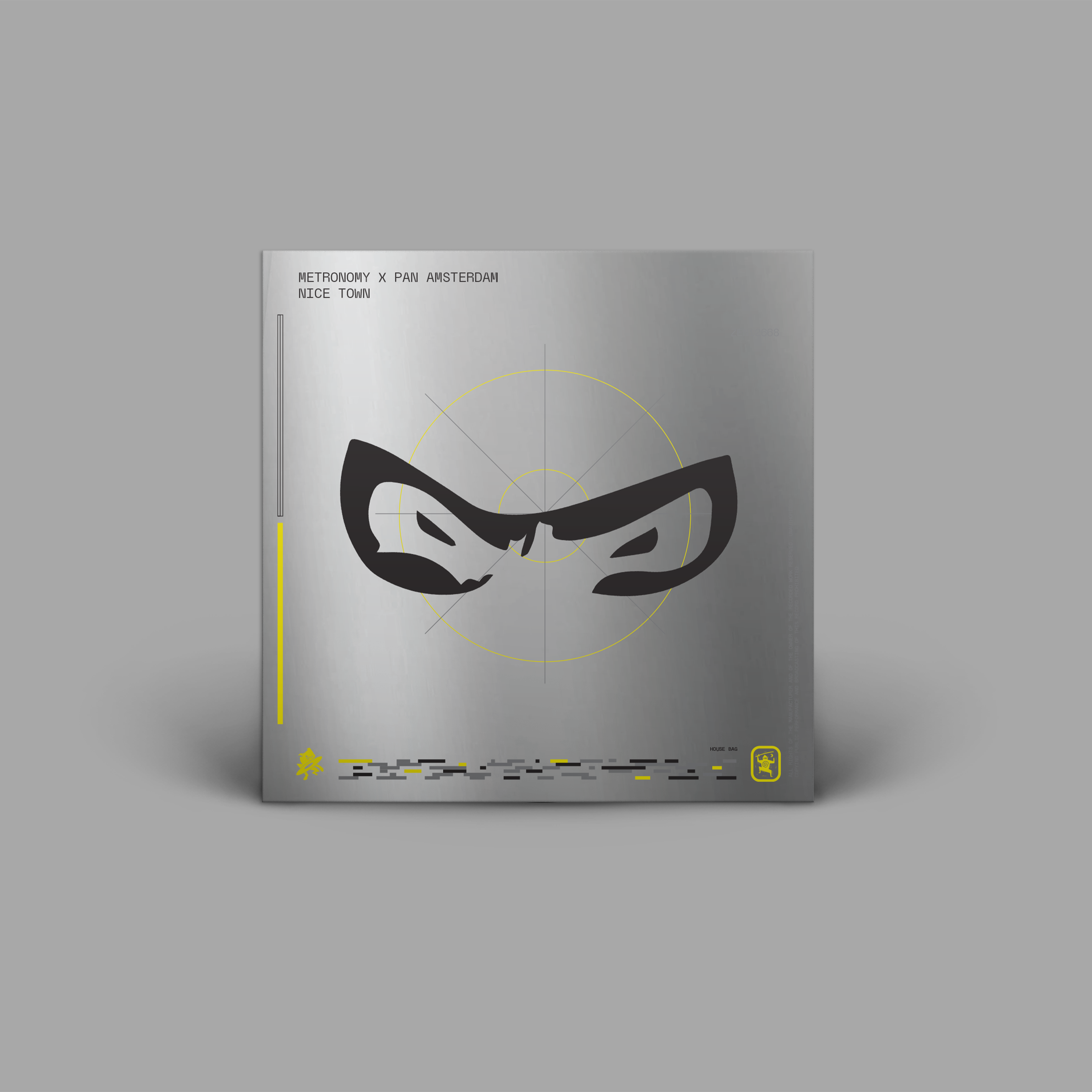
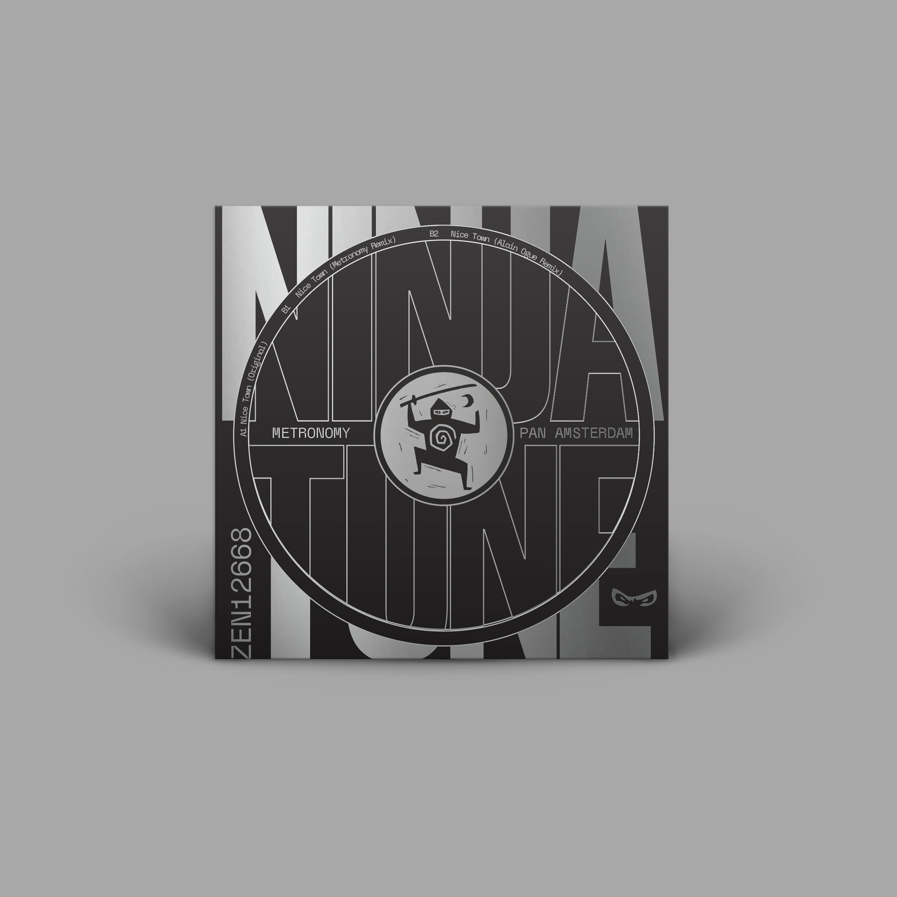
METRONOMY X PAN AMSTERDAM - NICE TOWN
The brief: use the original template for ninja tune’s ‘house bag’ to create the print files for this release, and, to also, give alternative design options inspired by ninja’s releases from the 90s. When designing an album cover for print, alongside following the brief, there a three things you need to consider: visual impact, branding and practicality.
My options focused around the iconic ninja logos. Their resurrection pulls in listeners from the early days, whilst ensuring a consistency for further releases to follow a similar template. The point of this? To maintain recognition. Keeping in mind the dimensions and format of the LP cover, guarantees the artwork translates well to physical and digital formats.


THE SELECTED DESIGN >

